
Olive & CamelliaA website that opens the door before guests arrive.
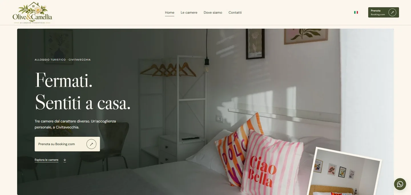
A website for a guest accommodation in Civitavecchia, built around the photography and character of its three rooms. From exploring the spaces to booking on Booking.com, with content in eight languages and direct contact with the property.
The project at a glance
- 3 roomsOlive, Camellia and Dahlia, each with its own page and gallery.
- 8 languagesA journey designed for international guests too.
- Custom designBotanical identity, layered photography and dedicated motion.
- Booking.comThe property’s chosen booking service.
Starting point
Olive & Camellia is a guest accommodation on Via Bramante in Civitavecchia. Its three rooms share a welcoming atmosphere, each with different colours, details and guest capacities.
The starting material was the botanical logo, photographs and information supplied by the client. Francesco Guiducci’s work gave those materials a structure, visual direction and navigation journey.
Three personalities. One recognisable presence.
The website needed to convey the differences between Olive, Camellia and Dahlia, make amenities and location easy to find, and help international guests choose a room.
The visual direction draws on the spaces: ivory, olive and gold, large photographs and botanical details. Animation adds depth while preserving natural scrolling.
From the property’s materials to a complete experience.
Every element has a role: photographs tell the story of the spaces, pages answer questions, and links lead to the next action.
The starting material
- The property’s logo and identity.
- Real photographs of rooms and shared spaces.
- Information about hospitality, amenities and location.
The completed website
- A photographic homepage and dedicated room pages.
- Content in eight languages, with switching to the equivalent page.
- Bookings on Booking.com and separate direct contact options.
The work
Visual direction and motion
Layered photographs, an animated sign and botanical details accompany exploration. Motion respects the system preference for reduced animation.
Room pages and galleries
Each room has its own page, with a photo gallery, guest capacity and amenities. The homepage introduces the differences and links to the details.
A journey in eight languages
Italian, English, Spanish, French, German, Portuguese, Simplified Chinese and Japanese. Language switching keeps visitors on the equivalent page.
Booking and enquiries
Booking calls to action lead to the property’s Booking.com listing. WhatsApp, email and telephone let guests ask the property a question directly.
Photography and development
The client’s photographs are optimised for different screens. The website and hosting belong to the client; essential content remains available without JavaScript.
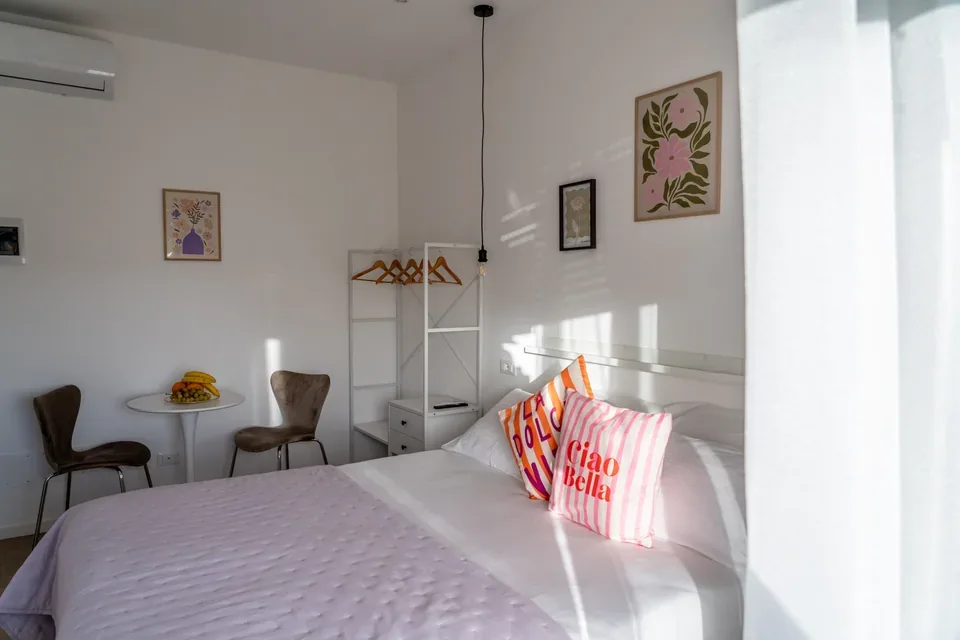
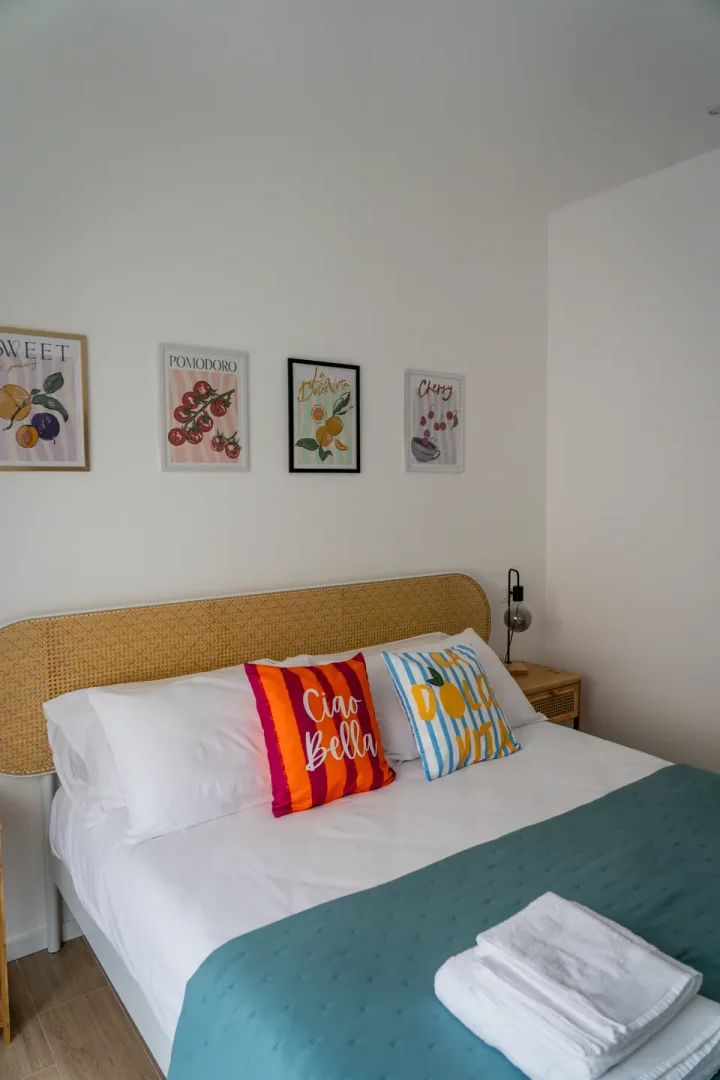
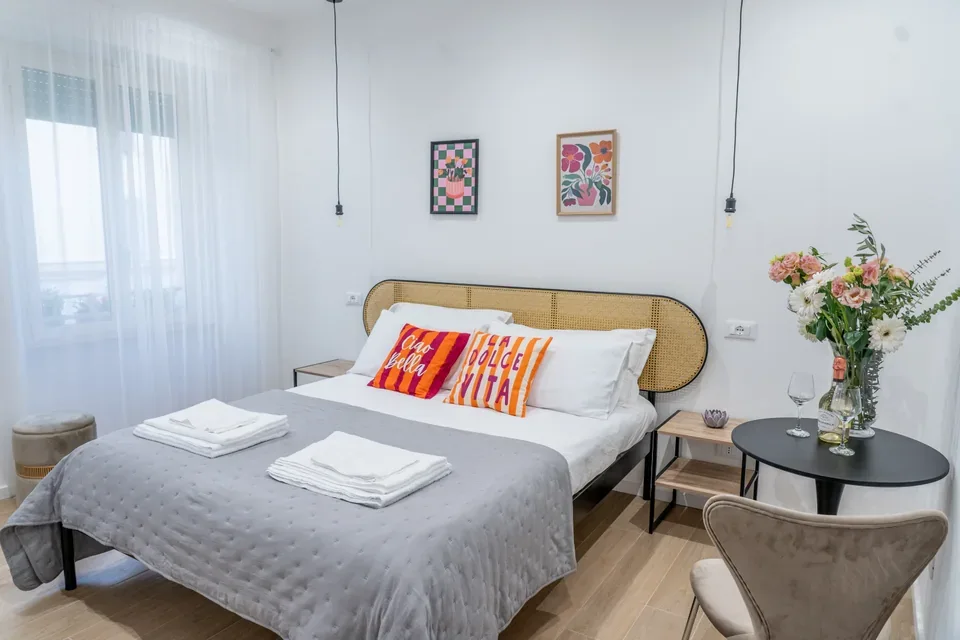
Real spaces. The starting point of the design.
Photographs supplied by the client.
The result
A recognisable digital presence that lets guests explore rooms, amenities and arrival information before their stay.
The journey keeps responsibilities clear: the website presents the experience and makes contact easy; dates, rates, availability and booking confirmation remain on Booking.com.
The character of the rooms, on the web.
This case study documents website design and development. The client supplied the logo and photographs, which were adapted to the digital experience.
No client financial data is published, nor commercial results attributed to a single intervention.
A website that tells your story.
Business, institutional and corporate websites with structure and visual direction shaped around the project. The first step is to understand the context and goal.